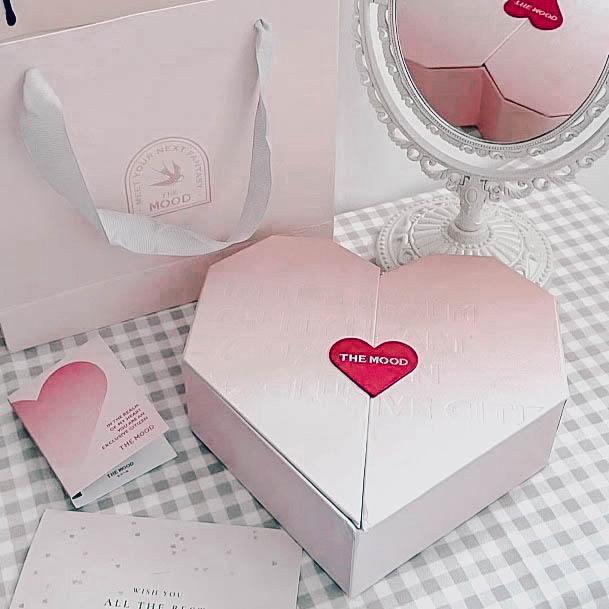
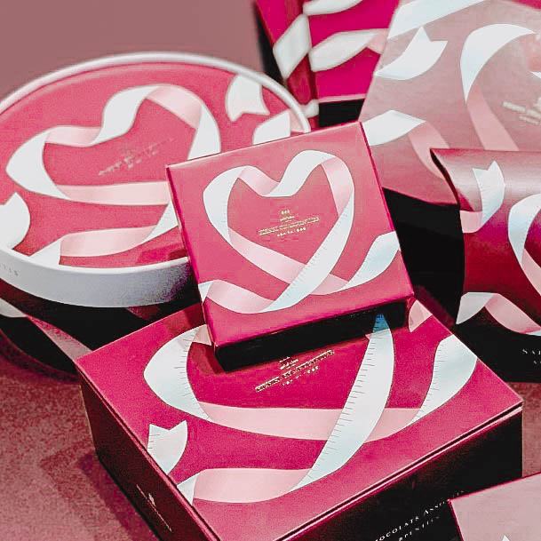
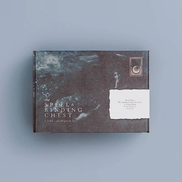
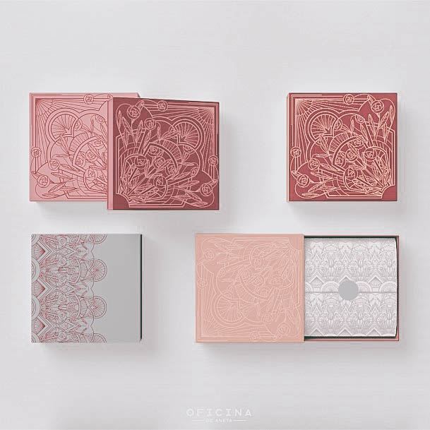
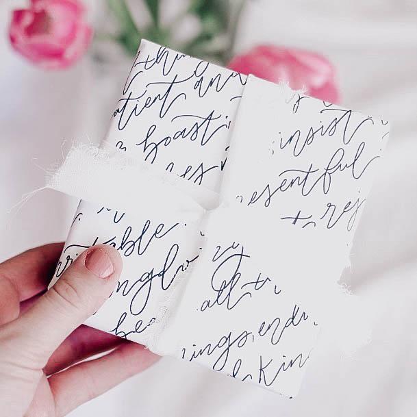
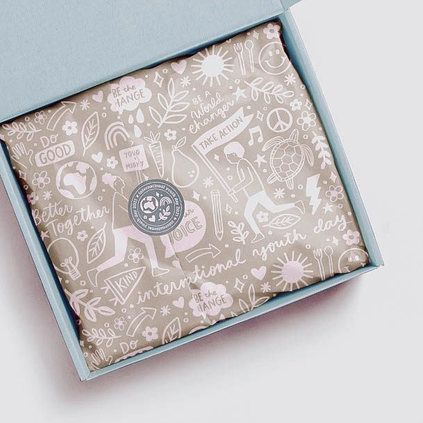
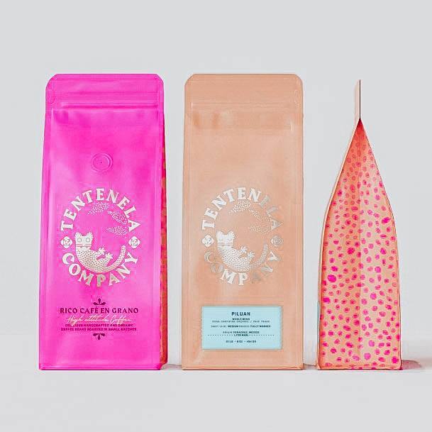
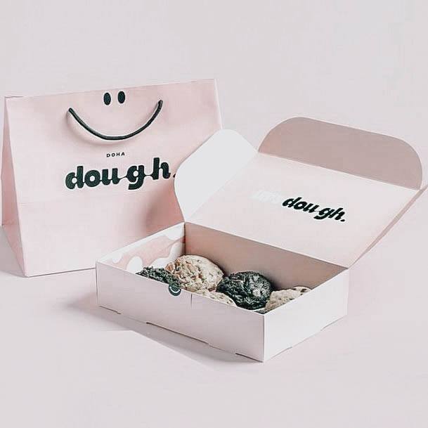
One of the best ways to capture that appreciation is through your packaging.
The days of stuffing your products into a brown paper bag or cardboard box are over. Back then, those efforts were fine and dandy, but that’s only because business was done face to face, relationships were built, and handwritten letters were exchanged.
Today, package branding is key to any successful business. Any small business can get a color scheme, beautiful logo, and rock star message statement, but how can you combine all of those elements into one stunning product presentation?
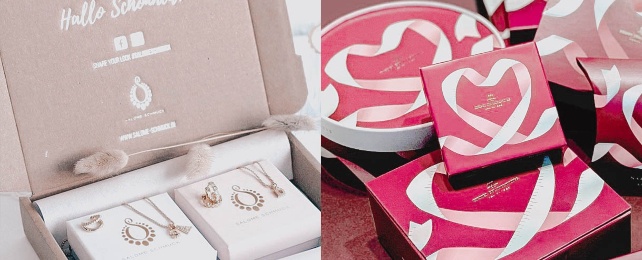
Let’s start with the product itself; is it already in a container, or does it need to be encased in a small box? For small items such as jewelry, consider screen printing your logo or brand symbol on a mini-colored box. For a more delicate, more luxurious impression, emboss your design. Carefully consider the color of the padding or the pattern of the tissue paper.
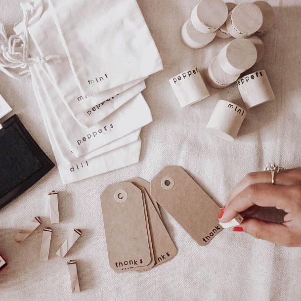
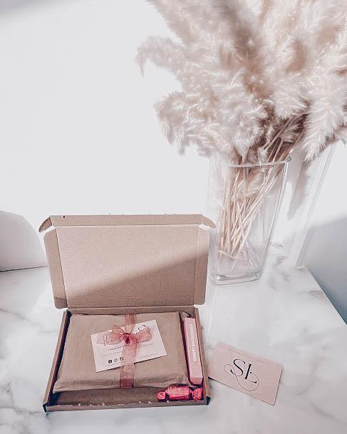
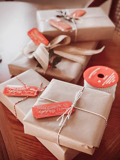
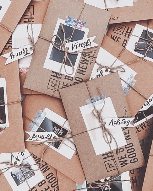
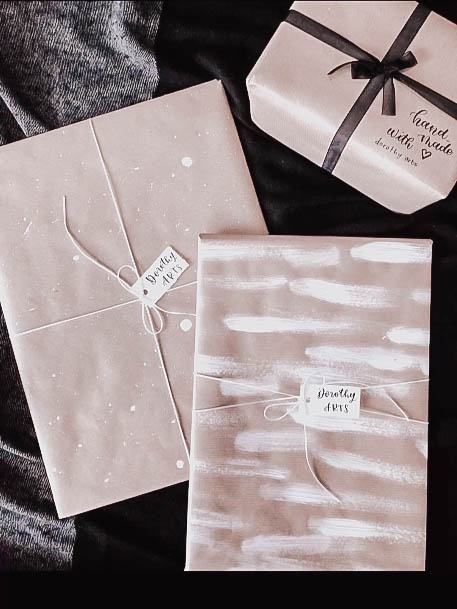
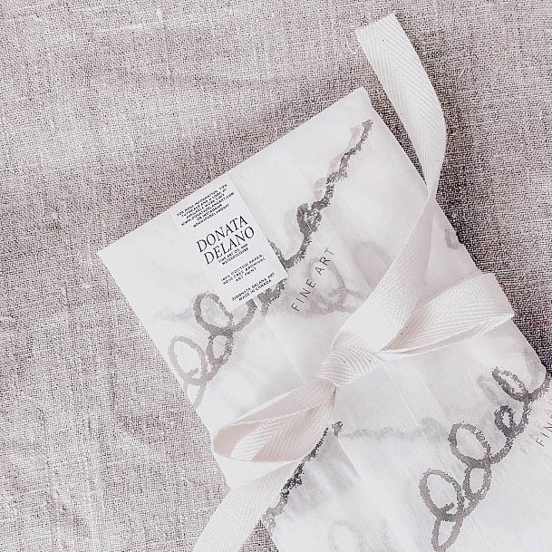
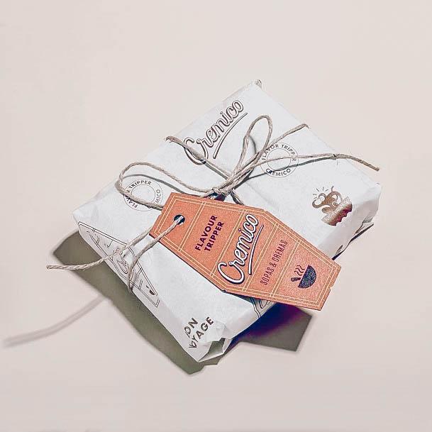
If you’re going box-less, you can opt for patterned wrapping paper and tie it together with a decorative string. For good measure, add a branded sticker at the paper edges to keep everything nice and neat. You can connect a decorative tag to the string and deliver any message. Some go as far as to include a hand-stamped wax seal on the tag.
Another option is upgrading the thin string for a beautifully bouncy bow or silky, tightly tied ribbon.
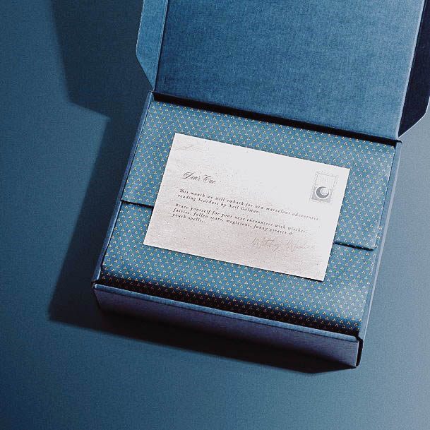
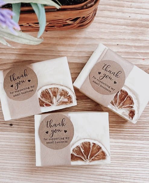
No package is complete without a personalized thank you card, free sample, or misc item that delivers a genuine surprise to the customer.
Now, there are a million different small business packaging ideas out there, but rather than give you specifics; I’d like to show you some of my favorite examples below.
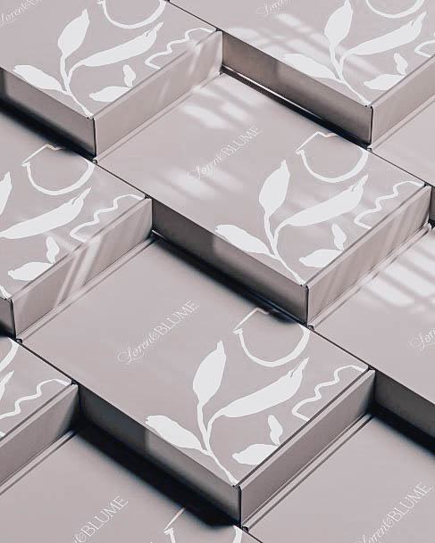
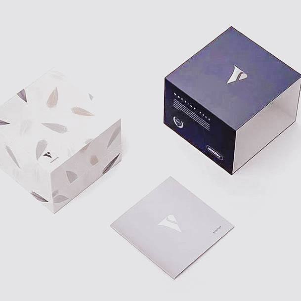
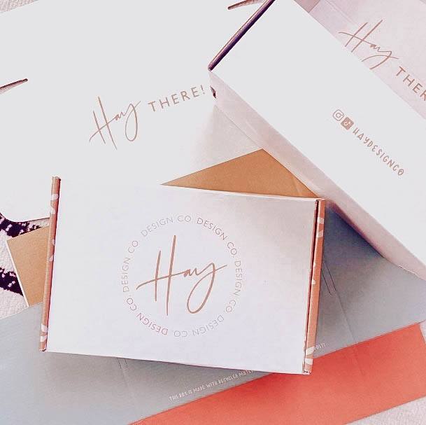
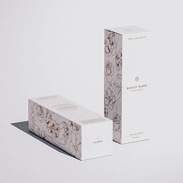
I love how simple yet, elegant these soft grey and white packaging boxes are. A simple cursive and captical logo above a beautiful flower pattern give these branded pieces a touch of class.
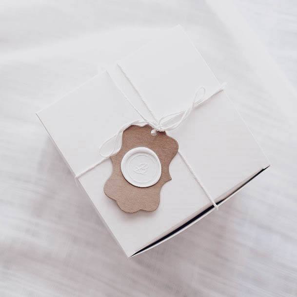
Bring back royal vibes with this simplistic all-white themed package design. Note the hand-pressed wax seal over a basic paper tag that has been ornately shaped. A white string holds it all together beautifully. While the stamp is time consuming, this setup is very affordable.
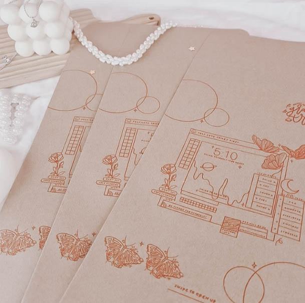
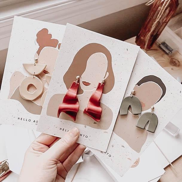
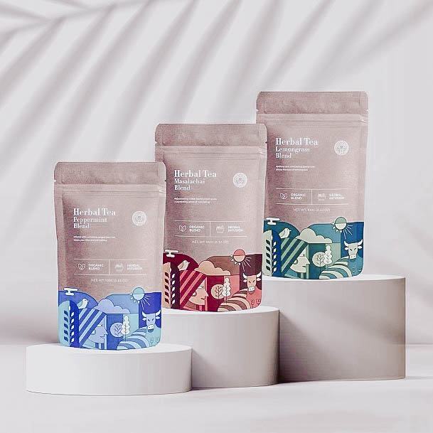
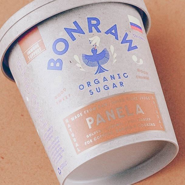
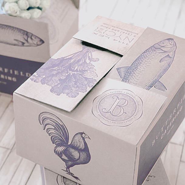
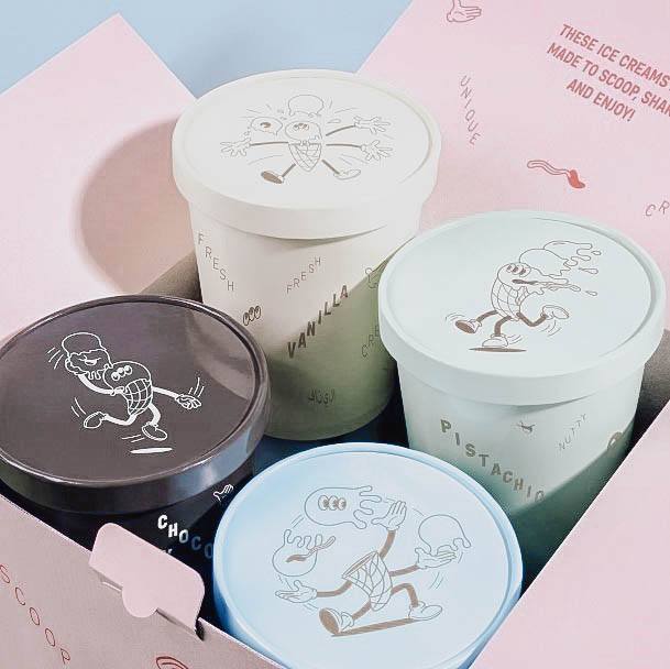
When it comes to packaging you’re not limited by your logo or message statement. Consider having some fun with custom illustrations and unique objects of curiosity as shown above.
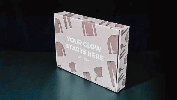
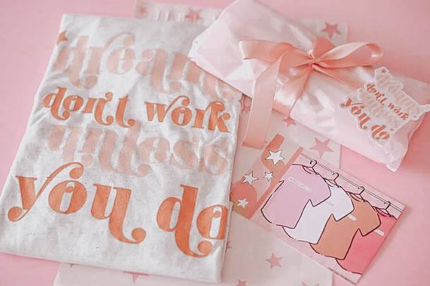
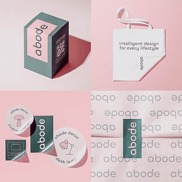
My favorite part about this packaging idea is the clothing pattern that covers the entire box, including the sides. A strongly bolded message takes the center stage.
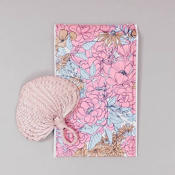
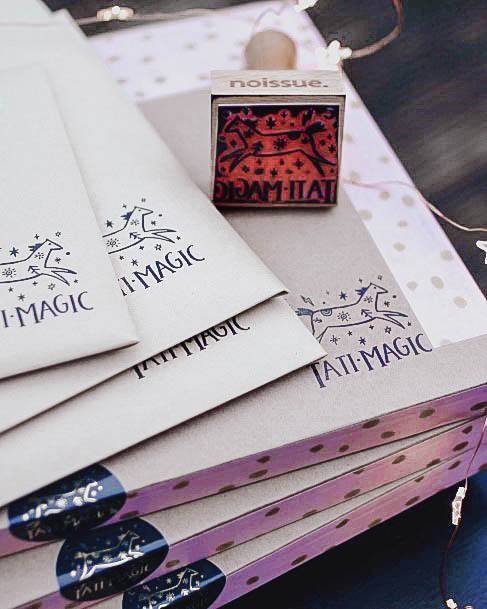
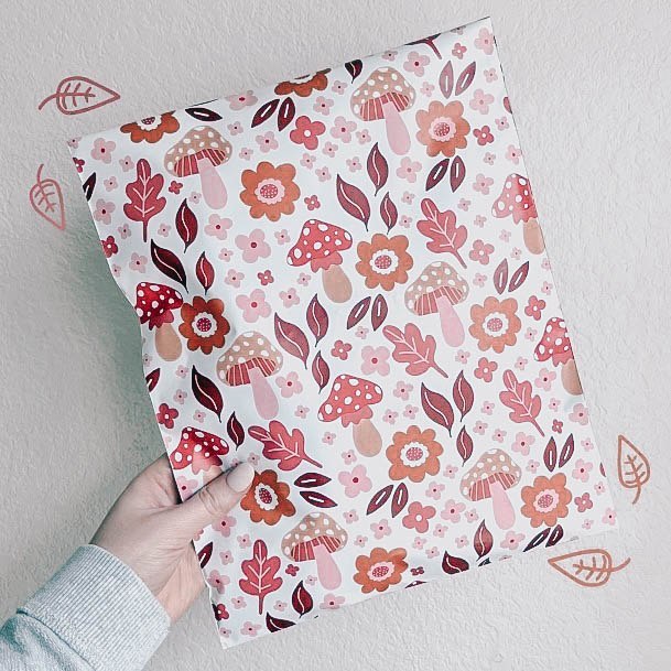
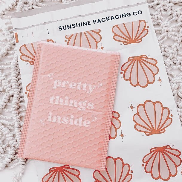
You don’t have to settle for boring black, white or manila envelopes these days. Small businesses everywhere are shipping out padded mailers and envelopes with all sorts of fun printed designs on them.
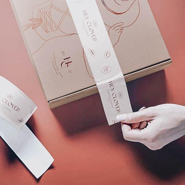
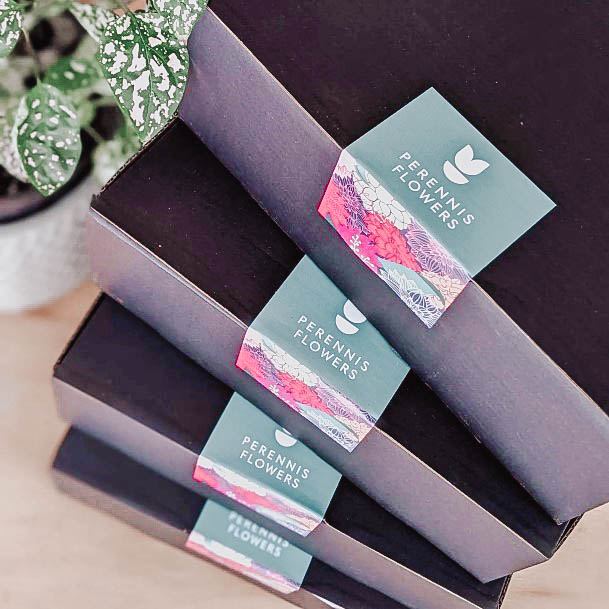
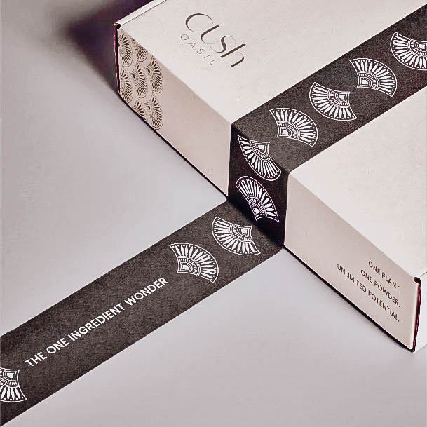
To set your business apartment from the competition consider ditching the clear shipping tape and going with custom label tape.
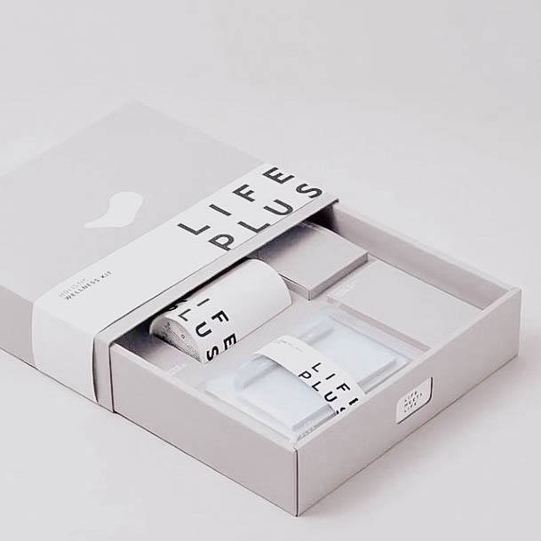
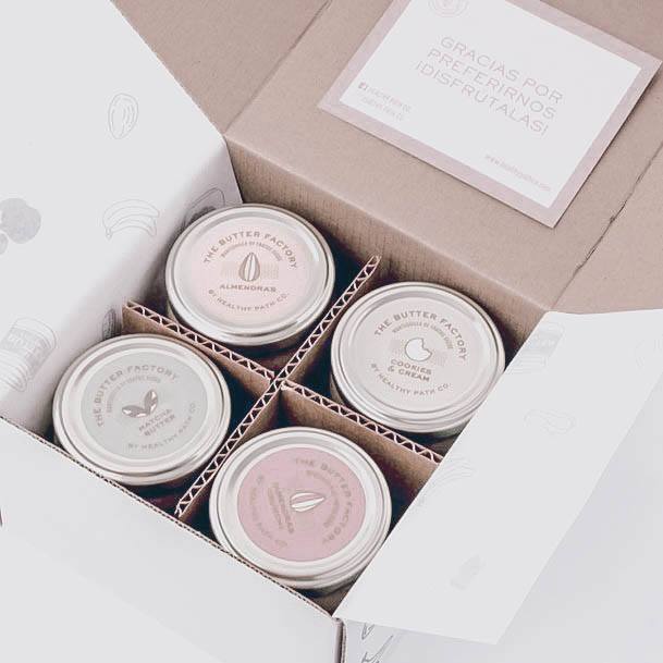
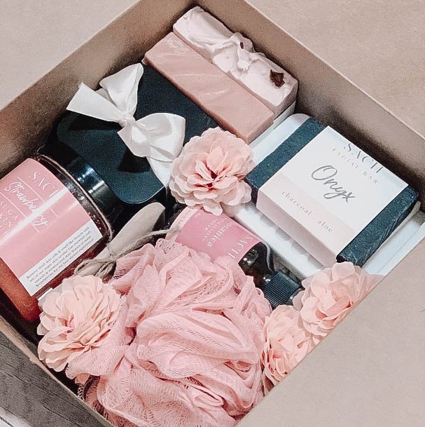
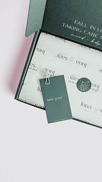
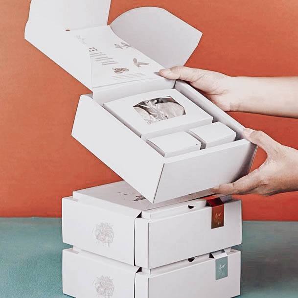
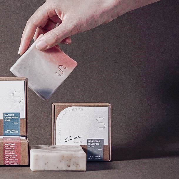
This packaging idea is incredibly modern, but what stands out the most to me is just how snug all of the individual products are. The designer paid special attention to detail here with this wellness kit packaging.
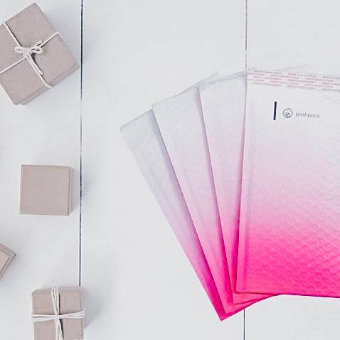
Here’s a fun padded mailer packaging example that captures your attention right away. The hot pink gradient gives this design a bold edge. For female focused products, this can be a great design to consider.
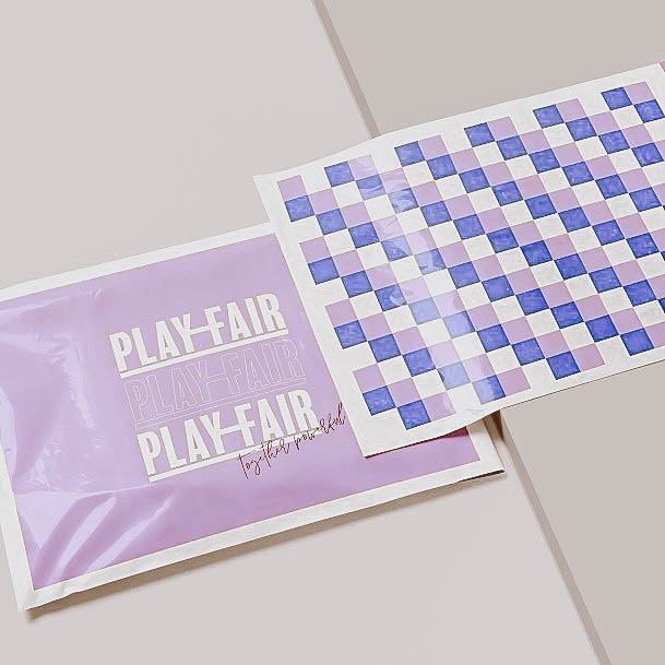
When it comes to shipping clothing, very few small business these days use boxes. Just about every small business is opting for plastic pouch-style bags that can fit a handful of folded fashion products. Note the brand on the front, with a unique checkered pattern on the back. If money is no object when it comes to branding material, then you could also consider running the same pattern on the interior of the bag.
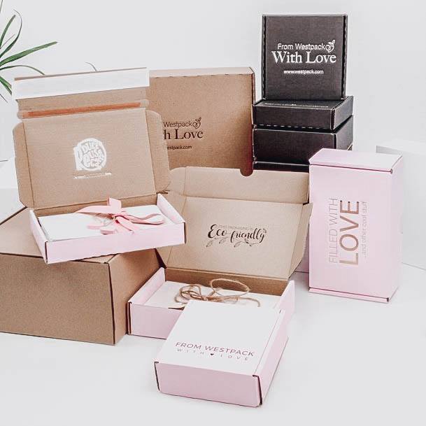
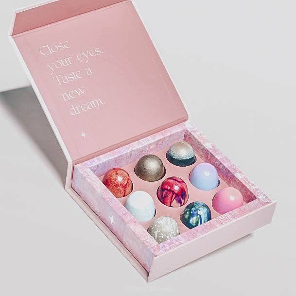
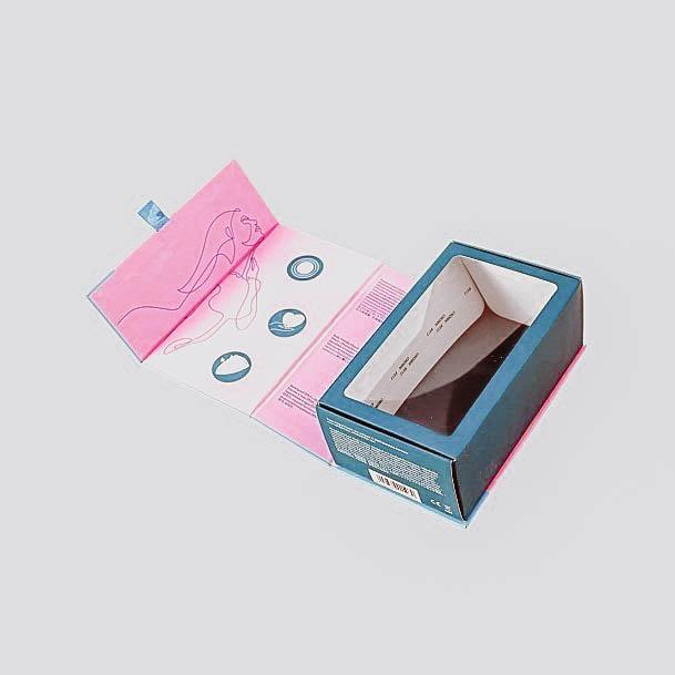
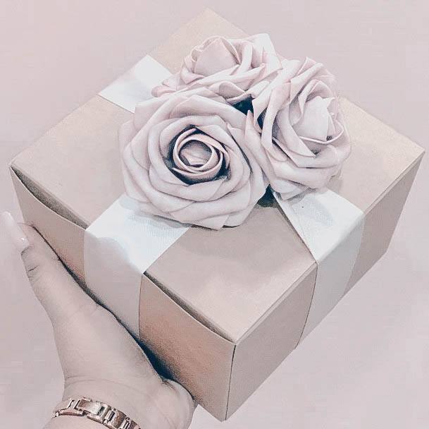
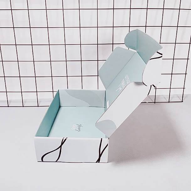
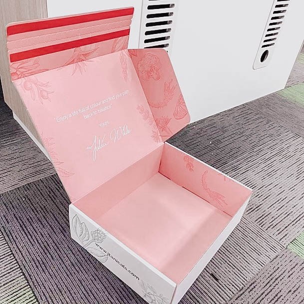
You can truly capture a beautiful feminine essence without having to resort to flashy graphics or over the top pattern details. Take this packaging idea for instance; it features a soft pink exterior with a basic, un-finished interior. A screen-printed logo on the flap is all that is needed on the inside. For smaller sized boxes, do yourself a favor and always wrap cards or paper stock in either ribbon or twine.
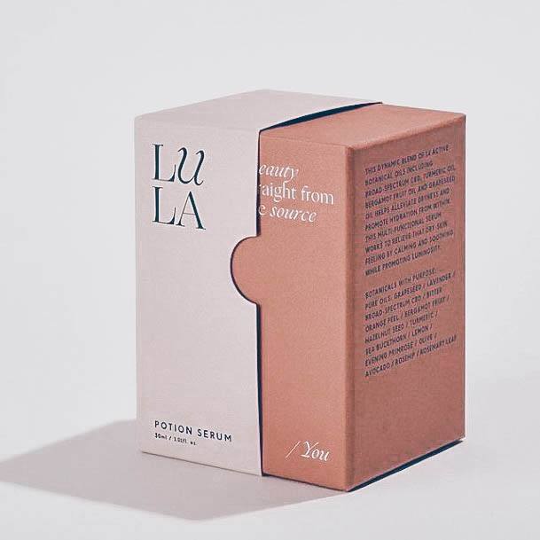
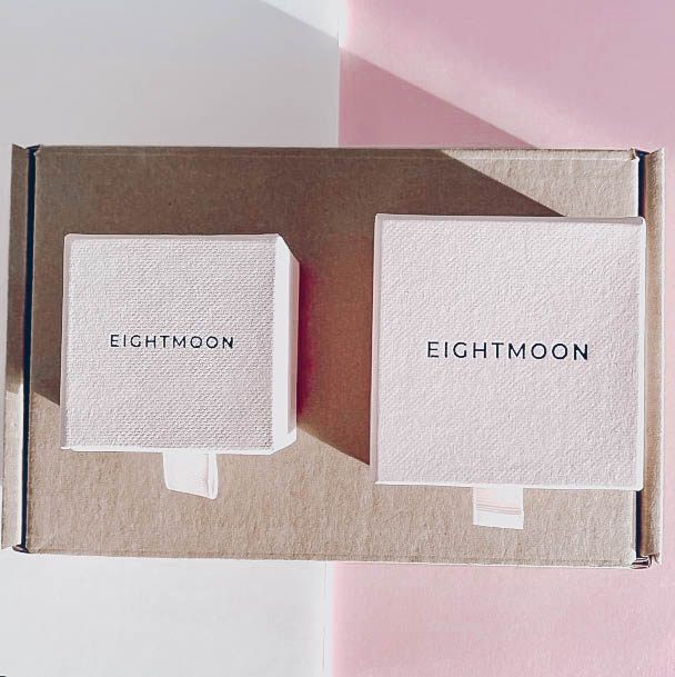
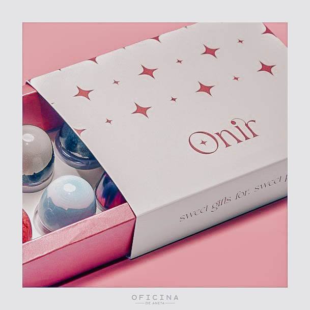
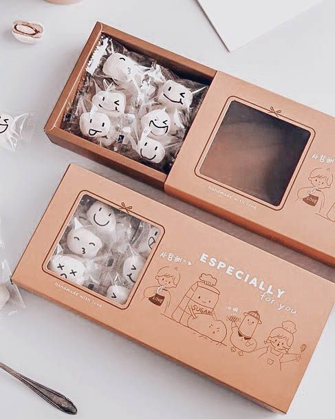
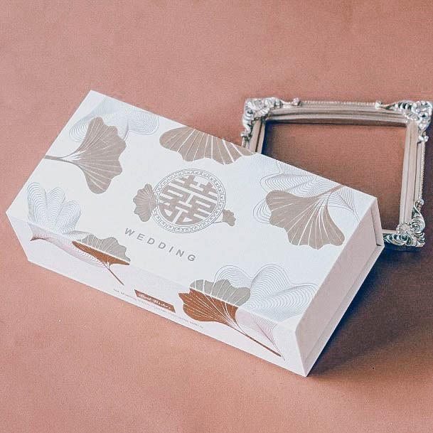
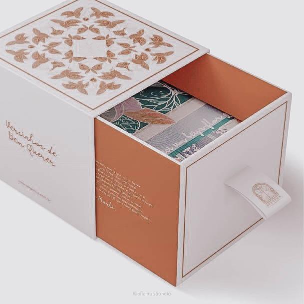
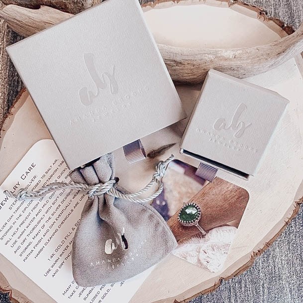
Can you imagine how satisfying it is to slide open this box and reveal the inner product? I love boxes that give a new take on the way we opening things. Everyone is used to the classic ring box that pulls up and the lid comes off, but the side sliding design is unique. Note how simple the text-based design is, even without patterns or other graphical effects, it’s very luxurious.
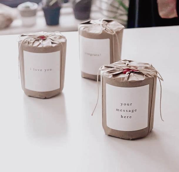
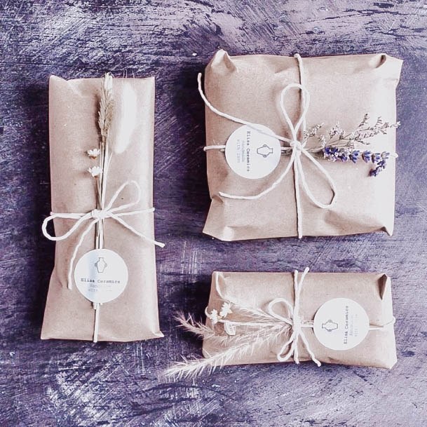
Some products can be rather difficult to packaging up and candles are no exception. The cost of candle boxes can add up quickly and cut deeply into your margins. Luckily, I have the solution for you. Check out the awesome paper wrapped candle option above that features a wax seal and simple string tie. A basic peel and stick sticker on the front is all that’s needed to give your client a unique form of appreciation.
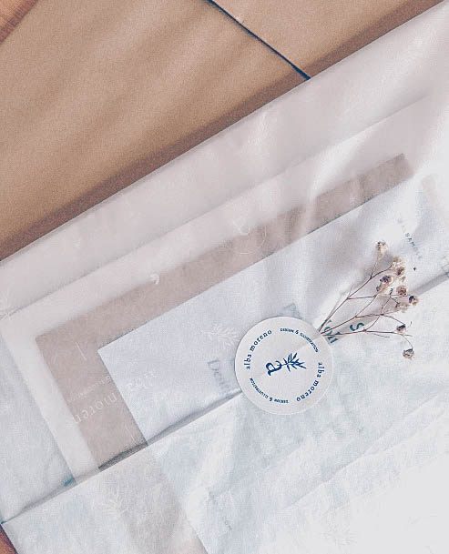
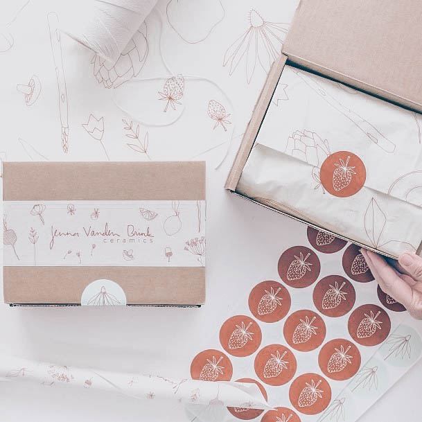
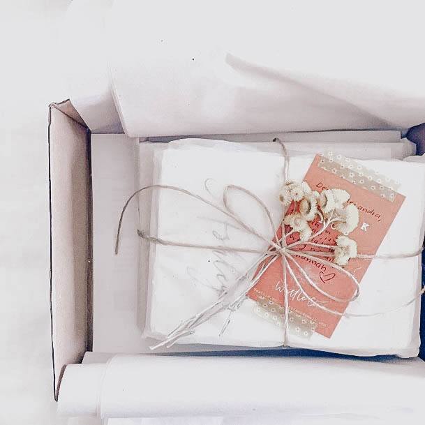
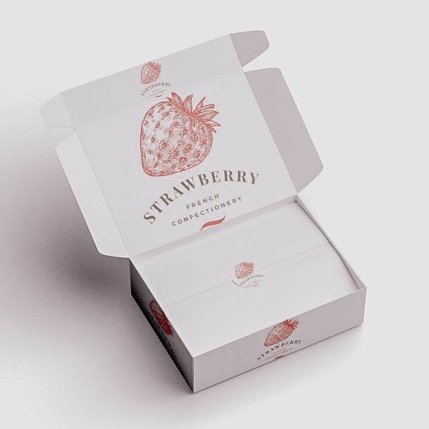
I love the delicate eco-friendly look of this white tissue paper packing alongside the addition of a tiny bouquet of baby’s breath flowers. A round branded sticker holds everything nearly in place.
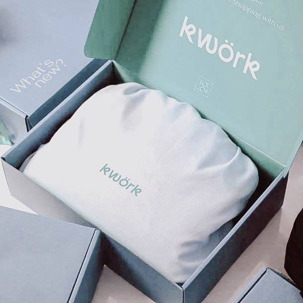
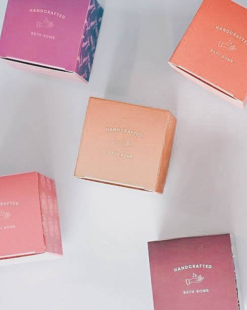
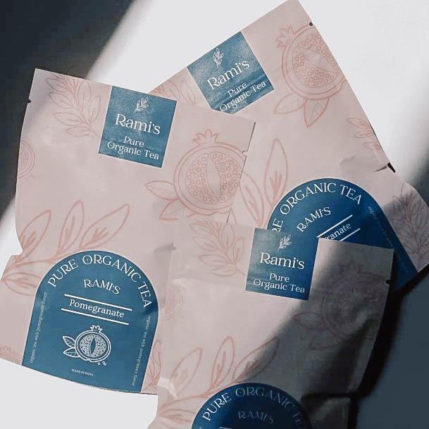
Soft pastel colors give package a simple look while a white ink message and logo match the white product cover. For a unique touch consider placing your products inside of a branded bag. This small business packaging idea reminds me of how UGG ships out their boots.
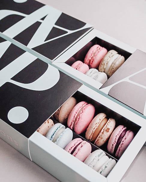
Yum, macarons, cookies and desserts! This package idea is a wonderful example of how to use a negative space design efficiently. Note the AP logo that covers the entire front of the box, while the background color can be found on both the sides and interior edges.
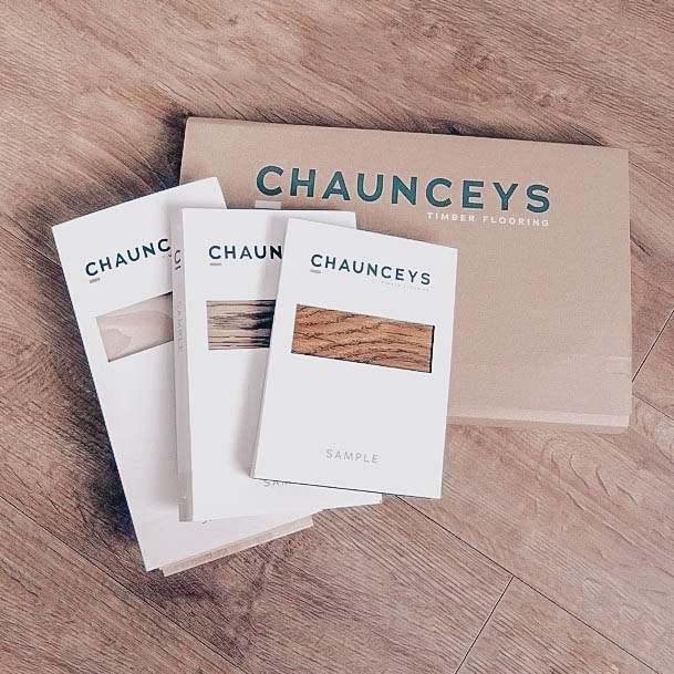
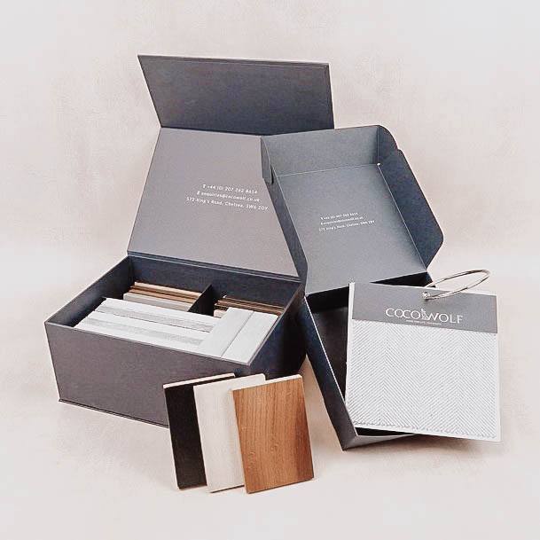
Here’s a unique way to package product samples such as hardwood flooring, tile or carpet. I love how Chaunceys has given their boxes a small see-through portal for quick identification, while the main shipping box features a s simple printed logo. The overall design is efficient, cheap, and functions beautifully.
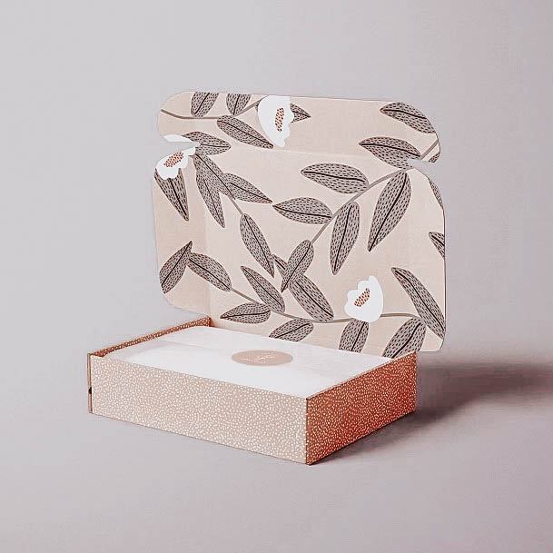
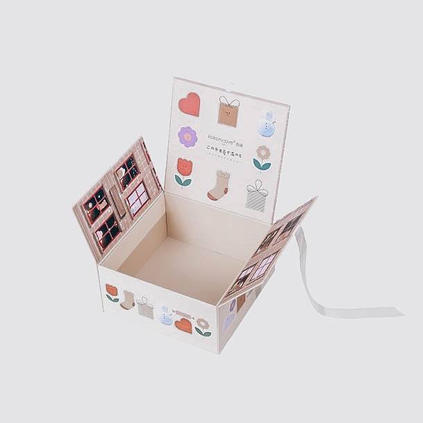
Nothing gives off that “wow” impression quite like stunning patterns that are placed on the interior lid of any packaging box. This example is a wonderful example of just how well a pattern detail can work to really enhance your brand’s image. Note the fun dotted orange and white sides of the box which boldly stand out on their own. White tissue paper and a neatly placed center stick give this otherwise eye-catching idea a very soothing look.
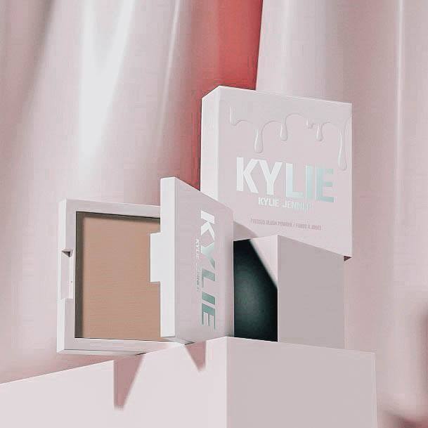
In the highly competitive world of cosmetics how do you stand out? Having a quality product is one thing, but let’s face, your packaging design is going to either make or break your business. I love this Kylie Jenner themed makeup container which features a soft pink finish, and metallic foil logo. A raised texture dripping liquid adds not only a cool look, but a unique packaging characteristic that you can feel.
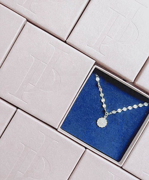
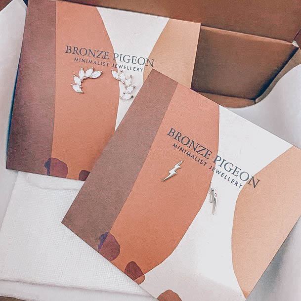
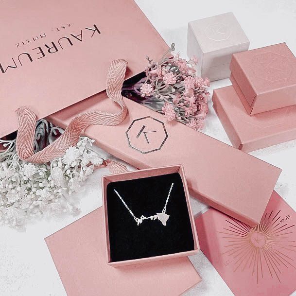
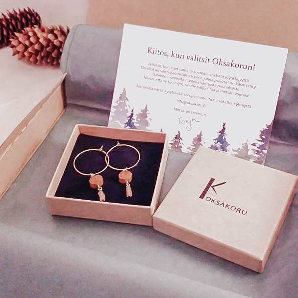
For all things jewelry it’s hard to go wrong with a simple jewelry box. This classic piece of packaging can be customized virtually any way you like. While I’m not of a fan of the brighter blue against a pale pink; it’s important to note that contrasting velvet interior background can make your jewelry “pop.” Note the nice embossed logo detail on the box top.
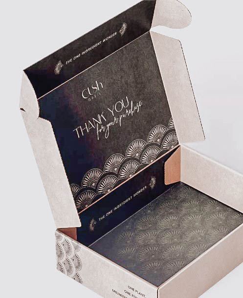
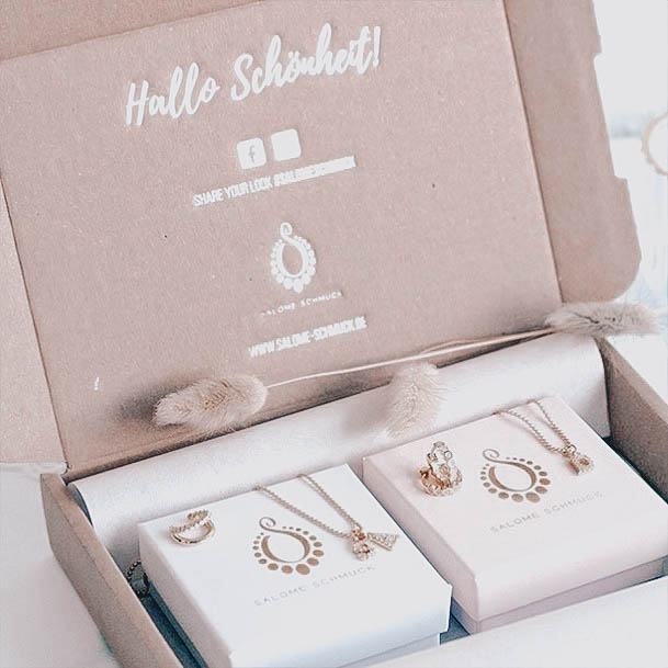
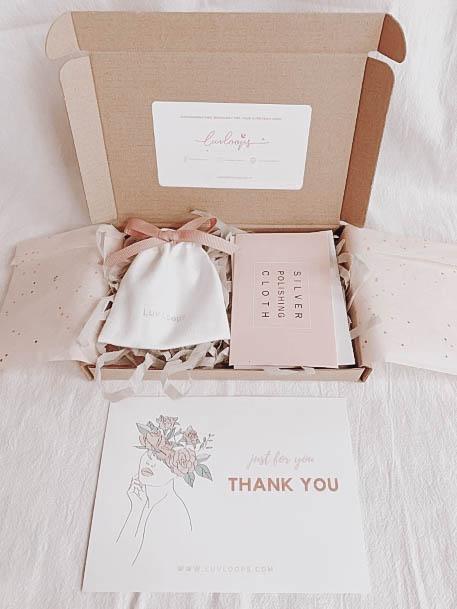
I love this partial pattern cardboard box design which uses contrasting black and white ink for a truly luxurious vibe. This small business packaging idea is a perfect example of how you can accomplish so much with ornate pattern details. Note the “thank you” wording which can be seen as the customer immediately opens the package. If you don’t want to deal with thank you cards, then this is another money-saving option to consider.
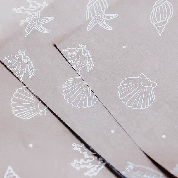
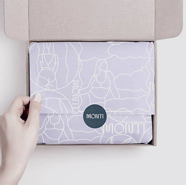
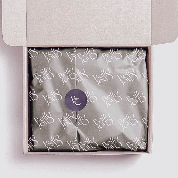
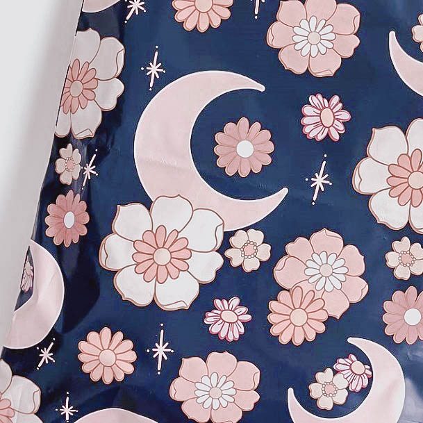
Sometimes it’s not all about the box itself. In this case, I wanted to show you that what goes in the box can have a major impact on your customer’s overall brand impression. I find this grey tissue paper to be simply beautiful with its delicate sea themed object pattern. Anyone can package up their goods in white or solid color tissue paper, but have a branded material like the paper above, take things to the next level.
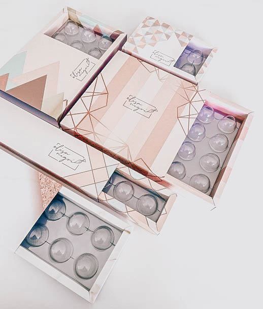
Here’s some striped and geometric inspiration for all your packaging needs. Instead of going with just colored lines, they’ve chosen to go with a stunning gold-foil detail. Note the customer interior of these boxes which securely holds each individual piece of product.
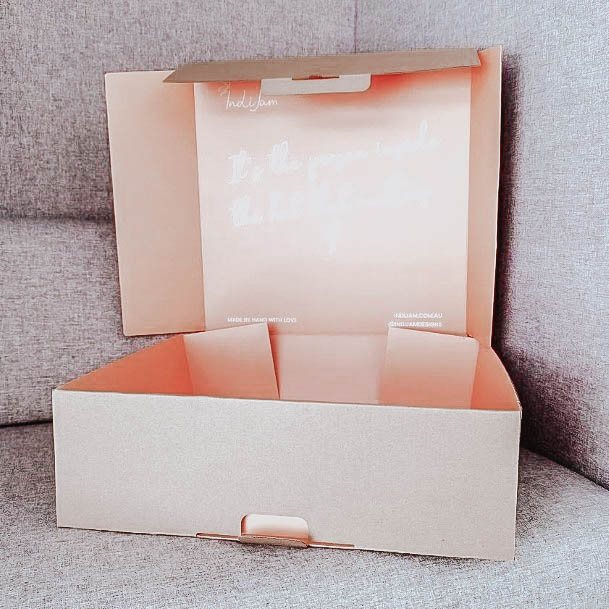
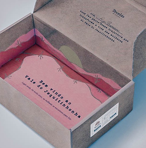
Let the inside of your packaging deliver the “wow” factor. The rest of your product shipping box can be completely unfinished aside from perhaps a small logo print or simple sticker. This peach interior colored package is a glowing example.
